
No, David Attenborough: Africa hasn't warmed by 3.5 degrees C in two decades
It's not often one looks to the Guardian's environment pages for an incisive and thorough critique of green propagandising. But hats off – really – to Leo Hickman for this ruthless deconstruction of an erroneous claim made by David Attenborough on his latest BBC nature documentary that in the last twenty years Africa has warmed by 3.5 degrees C.
3.5 degrees C in two decades? That would indeed be a remarkable temperature rise in anybody's money. (Remember, since 1850 global mean temperatures have risen by about 0.8 degrees C – and we're supposed to find that worrying and significant). Which is why, you might have thought, the BBC would have spotted so obvious an error and removed it before the programme went out.
To his credit, this troubled Leo Hickman, too.
I'd never heard this arresting claim before. If that rate of temperature rise continued over, say, a century, then those parts of Africa would see a deathly rise of 17.5C?! Could that claim really be true?
So began his wild goose chase to track down the source of the BBC's factoid. As you'll see from his superb piece he never got a terribly satisfactory answer.
I was told that it came from a report published in 2006 by the "Working Group on Climate Change". The full title of the report was "Africa – Up in Smoke 2: The second report on Africa and global warming from the Working Group on Climate Change and Development" and it was "written and compiled" by Oxfam and the New Economics Foundation, with the support of a wide range of environmental and development NGOs such as Greenpeace, Friends of the Earth, WWF, Cafod and the Institute of Development Studies.
This, in turn, takes him to a report produced by Christian Aid; and thence to the Climatic Research Unit at the University of East Anglia – which has a stab at citing a "peer-reviewed" article in Nature, which doesn't support the claim made in the programme either.
What's rather touching about this is that Hickman is so surprised. Those of us who follow Donna Laframboise's research, for example, will have long been wearily familiar with the extent to which the IPCC's supposedly authoritative reports depend on "grey literature" – ie propaganda – produced by activists at organisations like Greenpeace, Friends of the Earth, Cafod, etc.
Hickman writes:
Personally, I find it bizarre – and frustrating – that an otherwise exemplary series, which took years to film, has been tainted – in my mind, at least – by such a sloppy piece of research. Why rely primarily on a seven-year-old report published an NGO? Why not just directly ask climatologists who would have the latest available data to hand? And how did the BBC's researchers even come across such an obscure fact? You get the sense they simply Googled "Africa temperature rise" and went for the first thing they found.
I agree. But it's so much nicer – and frankly more damning – when instead of my saying it comes from someone on the other side.
From the Guardian
BBC exaggerated climate change in David Attenborough's Africa
Updated: David Attenborough claims in BBC One's Africa series that part of the continent has warmed by 3.5C over the past 20 years
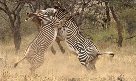
Zebras do battle in one of the more memorable scenes in the BBC's Africa series Photograph: BBC NHU
The BBC's natural history unit in Bristol is, rightly, respected across the world. No one else can match the professionalism, vision and majesty of its epic, beguiling programmes about the planet's wildlife. For anyone looking for a reason to justify theBBC licence fee, look no further that the unit's output.
Its latest series – Africa – concluded this week on BBC1. The last episode was devoted to examining how the continent's wildlife was at a "pivotal moment in their history".Sir David Attenborough, the series presenter and narrator, explained to viewers what pressures many endangered species now face as they come into conflict with the needs of local human populations. He also devoted a section of the programme to the challenges presented by climate change.
But it was during this section that - like a meerkat sensing danger - my ears pricked. Set against footage of elephants walking beneath Mt Kilimanjaro, Attenborough said:
Africa's climate is certainly changing. Some parts of the continent have become 3.5C hotter in the past 20 years.
(For UK-based viewers, here's a direct link to the quote on the BBC iPlayer. The link will expire on Sunday, 17 February.)
I'd never heard this arresting claim before. If that rate of temperature rise continued over, say, a century, then those parts of Africa would see a deathly rise of 17.5C?! Could that claim really be true?
I also noticed some people on Twitter asking the same question. So the following morning I called the BBC press office and asked where this information about a 3.5C temperature rise over 20 years had come from.
I was told that it came from a report published in 2006 by the "Working Group on Climate Change". The full title of the report was "Africa – Up in Smoke 2: The second report on Africa and global warming from the Working Group on Climate Change and Development" and it was "written and compiled" by Oxfam and the New Economics Foundation, with the support of a wide range of environmental and development NGOs such as Greenpeace, Friends of the Earth, WWF, Cafod and the Institute of Development Studies.
Page 5 contained the relevant passage (pdf):
The maximum temperature in Kericho, a highland area in the Rift Valley province where most of Kenya's tea exports are grown, has increased by 3.5°C during the past 20 years. In Lamu, on Kenya's north east coast near Somalia, the maximum temperature has increased by more than 3°C since the 1940s.11 The UK's Hadley Centre says temperature increases over many areas of Africa will be double the global average.
The footnotes said that the 3.5C claim was taken from a Christian Aid report, also published in 2006, called Climate of Poverty. On page 30 of that report (pdf), it said:
The rapidity with which glaciers are melting shows that Kenya is getting warmer. This is confirmed by measurements on the ground. For example, the maximum temperature in Kericho, a highland area in the Rift Valley province where most of Kenya's tea exports are grown, has increased by 3.5°C during the past 20 years. In Lamu, on Kenya's north-eastern coast near Somalia, the maximum temperature has increased by more than 3°C since the 1940s.
Again, I looked to the footnotes to see where this claim came from. But it just said: "Conversation with authors; February 2006." It was unclear who the authors had conversed with. (I am still trying to reach the co-author who wrote that specific paragraph.) Either side of that claim, the authors quote Prof Eric Odada of the University of Nairobi and Peter Ambenje of the Kenya Meteorological Department. I have emailed both of them to seek their assistance in clearing this up, but have yet to hear back from either of them. (If I do, I will append their message to this post.)
But I was also curious about why Attenborough would have used a somewhat obscure factoid buried deep within a report published by an NGO as long ago as 2006 to make such an arresting statement within a primetime BBC natural history programme in 2013. And what of the source report's strange reliance on the term "maximum temperatures" rather than the more normal (and comprehensible) "average temperatures"?
So I went back to the BBC press office and asked it whether the production team, or Attenborough himself, had double-checked and verified this claim before broadcast. I also asked if the narration was scripted and researched by someone else for Attenborough to then read out, or whether he had done it all himself.
A few hours later, once it had spoken to the programme's production team, it sent me this statement:
There is widespread acknowledgement within the scientific community that the climate of Africa has been changing. The programme makers made use of a number of sources and statistics to illustrate this, in this instance from a report by The Working Group on Climate Change and Development and supported by published data from Nasa.
The press office sent me this Nasa link…
http://www.giss.nasa.gov/research/briefs/rosenzweig_02/
…and confirmed that the research for the programme was carried out by "production", not David Attenborough himself.
But the Nasa link also puzzled me. It is titled: "Science Briefs: Warming Climate is Changing Life on Global Scale. By Cynthia Rosenzweig — December 2008"
Again, why was the BBC relying on a somewhat obscure Nasa article published as long ago as 2008? Why not just draw upon the very latest scientific data?
The article itself supplies a global map (pdf) which shows regional variations in temperature. For Africa, it does show some regional temperature rises – not significantly over Kenya, it has to be said - but the information is very rudimentary and vague. It says it uses "linear trends of surface air temperature (HadCRUT3) between 1970 and 2004".
Either way, this does not represent the "20 year" period mentioned in the Attenborough narration. But, nonetheless, I asked the University of East Anglia'sClimatic Research Unit – who, along with the Met Office Hadley Centre, maintain theHadCRUT3 dataset (since updated to HadCRUT4) – for their own take on this specific claim.
I received this response from Dr Tim Osborn:
The claim about African temperatures ("some parts of the continent have become 3.5C hotter in the past 20 years") is based on maps from this peer-reviewed paper published in the journal Nature:
Rosenzweig et al. (2008) Attributing physical and biological impacts to anthropogenic climate change. Nature, 453, 353-357,doi:10.1038/nature06937.The map does show results from our dataset, HadCRUT3, for the period 1970-2004. So that's a 35-year period not 20 years. Also the top colour on the scale represents warming trends over the 25 years of between 2 and 3.5 degrees C - they could be anywhere within that range, not necessarily at the top of the range and still be shown by the same red colour. Also note that the two red colours are quite hard to distinguish in their figure, the slightly paler ones are for warming trends in the range 1-2 degC.I've done a trend analysis using our latest, updated dataset. This is HadCRUT4 and runs through to the end of 2012. These two files show the warming and cooling trends in each of the boxes that we split the world into. One file is for the global picture while the second zooms into the African region. There are three pages in each - one covering the last 20 years (because the quote above said 20 years), one covering 1970-present (because their original [Nasa] source started in 1970), and one covering the last 100 years (to give a longer-term perspective). On each page are 5 plots: 4 seasons (identified by the initials of the months, so MAM=March April May) and the larger one is the trend in the annual average temperatures.Note first that there are large white areas where there is insufficient data (or even no data). For these calculations I required at least 2/3rds of the data values to be present, otherwise I left it white. I assume the rate of cooling or warming during the years with missing values was the same as for the years where we do have data.For the last 20 years there is a paucity of data over Africa. In African regions with data there is only one box where warming in one season is above 3 degC. More boxes show warming in some seasons between 2 and 3 degC. No African boxes show warming above 2 degC in the annual average temperatures.Taking the 1970-2012 period (page 2) we find much better coverage. Note that my analysis required 2/3rds data to be present, therefore there could be missing data in some years (e.g. the last decade) but I still estimate a trend from the remaining years. Now there are more boxes with warming between 2 and 3 degC, and in the category above 3 degC, in individual seasons and also some in the annual means. However, those in the 3 degC category have incomplete data and shouldn't be relied upon heavily. The longer period gives more scope for greater warming (note that I am showing the overall warming for each period, not the rate of warming - with the same rate of warming, the amount of warming occurring over the 43-year period would clearly be greater than over a 20-year period, so this must be borne in mind when interpreting the maps).Taking the century-scale view, we can really say little about temperature changes in the interior of Africa (with a few exceptions). Coastal changes are typically warming by around 1 degC. So I would say that our data do not support the claim of 3.5 degC warming in the last 20 years in some regions of Africa.Taking a longer period since 1970 does suggest warming of up to 3 degC in some regions, and possibly above 3 degC but with considerable uncertainty due to incomplete temperature records. I would add the caveat that Africa, especially away from the coasts, has some of the sparsest measurements in the world. Coverage is incomplete and even where we have data it is based on fewer individual weather stations than is typical in many other continents. Our data do show overall warming in Africa, but with considerable uncertainties in the magnitude.3.45pm update: Dr Tim Osborn has emailed me to say, on reflection, he wishes to clarify the sentence I had emphasised in bold. This has been changed. It originally said: "So I would say that our data do not provide very strong support for the claim of 3.5 degC warming in the last 20 years in some regions of Africa."
(My thanks to Dr Tim Osborn for taking the time to provide such a detailed response. My emphasis in bold)
Christian Aid has subsequently sent me this report (pg 12, pdf) published by the United Nations Development Programme in 2008 which shows a temperature increase in Kericho of about 4C between 1960 and 2004.
But however you approach it, Attenborough's claim that "some parts of the African continent have become 3.5C hotter in the past 20 years" appears to fall down upon further analysis.
Personally, I find it bizarre - and frustrating - that an otherwise exemplary series, which took years to film, has been tainted - in my mind, at least - by such a sloppy piece of research. Why rely primarily on a seven-year-old report published an NGO? Why not just directly ask climatologists who would have the latest available data to hand? And how did the BBC's researchers even come across such an obscure fact? You get the sense they simply Googled "Africa temperature rise" and went for the first thing they found.
Update: 9 February The BBC has informed me that it is now removing this reference from tomorrow's repeat of the episode. It gave me this statement:
There is widespread acknowledgement within the scientific community that the climate of Africa has been changing as stated in the programme. We accept the evidence for 3.5 degrees increase is disputable and the commentary should have reflected that, therefore that line has been removed from Sunday's repeat and the iplayer version replaced.
I applaud the BBC for making this swift decision.


No comments:
Post a Comment